

Jackie has such a wonderful decorating style, very readable and friendly style of communicating and has given so much wonderful information for free that I just had to document for posterity just when I came across Teal & Lime and the impact it's had for me.
I started by signing up for and watching her Crash Course and I've spent a few days devouring Teal & Lime's archives in every spare moment, the three things that have helped propel me forward are Jackie's Crash Course video series, and two posts in particular; 7 Steps to Create Your Whole House Color Palette + Worksheet and How to Create Your Decorating Accent Color Palette.
For me, the real defining moment of discovery was the way Jackie has constructed her style statement. She broke it down into three sections - my style is ...; to me that means ...; and my style isn't ... This really helped me clarify what I'm working towards and come up with my own style statement.
My style is crisp, coastal (without being clichéd), softly tailored and incorporates some vintage pieces.
To me this means fresh, fun, handmade, suitable for a young family and incorporates vintage art deco pieces with quality low end items with a high end feel due to our budget constraints.
Our home feels welcoming, relaxed, open and fresh.
My style isn't country, rustic, shabby chic, minimal or sleek.
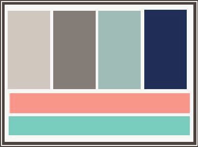
I also used her wonderful colour palette posts to define my palette as follows:
- Neutral -Dulux Vanilla Quake 1/2 - a lovely true grey which changes from almost white to deeper grey with the light
- First Bold - Dulux Timeless Grey - a deeper grey
- Second Bold - Navy - haven't settled on a colour yet as it's more likely to be a lounge colour than a wall colour
- Accent Colour - Dulux Zenith Heights 1/2 - a lovely light clear aqua - though I'm thinking of tweaking this to Rainwashed if I can find the formula for it here in Australia. The only walls this is currently used on is my laundry and also the back of my built in bookcases.
- Accent 1 - Aqua - in varying shades from teal to sea glass
- Accent 2 - Coral - I love how this combines with aqua to create what I think is a coastal vibe but without using the standard red white and blue.
At a time when I was stuck and felt like we had put down the first layer of our home (floors, walls and kitchen) but I was struggling to move forward from there Jackie's wonderful generosity with her information has helped me move forward. For that I cannot possibly thank her enough.
As an added bonus, I've also been led to a couple of other great blogs which I'm making some time to explore and connect with.


No comments:
Post a Comment